Pie charts
The pie chart is used for representations of percentage proportions.
It relies on CSS variables, an outrageous abuse of calc(),
display: table-*, clip-path, mask-image,
transform and a bit of SVG
to distinguish each area. Yes, I know how to laugh. How do we use it?
-
The
<table>itself carries a set of custom properties, corresponding to each values it contains as a percentage, useful for determining the angle each value should occupy on the circle. -
On each header
<th>, a --color custom property allows you to assign, well… a color ; and a --term custom property to get header in CSS. -
Then each cell
<td>must contain the value and its unit.-
All points of the
polygon()— used to draw the pie part thanks toclip-path— depend on --value, matching the corresponding custom property set on the<table>(eg. --1). Read the technical note after the example for details of the calculations. -
--start is the sum of the previous values and used to define the
starting point of the arc on the circle, applied
to the
rotate()function of thetransformproperty.
-
All points of the
-
A series of pseudo-boolean variables are computed using
clamp()based on the value (eg. --1), each worthing 0 or 1 :--lt-25: clamp(0, 25 - var(--value), 1),--gt-25: calc(1 - var(--lt-25))and so on — according to and idea of Roman Komarov in Conditions for CSS variables and some tricks shared by Ana Tudor, who calls it switch variables. They allow to toggle the points from their original position (50% 50%) to their calculated position, by adding or subtracting from the initial value usingmin()andmax()comparison functions; -
a
::beforepseudo-element on each cell<td>is formatted in a clever way according to all our variables, includingtransform,clip-pathandmask-image.-
Since
clip-pathstill requires a-webkit-vendor prefix for Safari andmask-imagefor WebKit based browsers, we use a CSS custom property to to prevent duplicate (long) values for those properties — trick shared by Michelle Barker in 7 uses for CSS custom properties.
-
Since
-
a
::afterpseudo-element is used as a tooltip, to summarize header and value for each cell —but the display of custom properties in a pseudo-element is not so trivial:-
contentonly accepts strings, and our custom properties contains… number. -
Once again we recycle
a Cassie Evans's trick based on
counter-resetand its default value to convert our --value custom property into a string. -
However
counter-resetrequires an integer, and we may have a floating number. We first need to make sure we're using an integer, so we rely on Carter Li's ruse to usecalc()to wrap our value— and@propertyfor Chromium-based browsers. Boum!
-
- And finally a pattern is applied to the background, in order to better associate it visually with the corresponding legend.
Switch
Allows you to disable styles on the following table.
| Resource | Proportion |
|---|---|
| HTML | 2 % |
| CSS | 2 % |
| JS | 32 % |
| Json | 1 % |
| Images | 44 % |
| Webfonts | 17 % |
| Other | 2 % |
A bit of trigonometry
In this graph, each portion represents an arc of a circle based on an angle (part of 360 degrees). To define the shape of this portion, a point must be placed on the circle.
To do this, I divide the circle into four squares. The position of the point on the circle can then be calculated using the properties of the right-angled triangle formed by:
- the center of the circle,
- the point we're trying to position,
- and the point perpendicular to the radius and passing through our target point.
We know the hypotenuse of this triangle — the radius of the circle —, and the angle formed by the hypotenuse and starting from the center of the circle (reducing the value to 90 degrees, since the circle is divided into four square sectors: if the value is greater than 25: minus 90°, etc.) — plus a right angle, of course.
Law of sines
We can therefore use the sine law
to measure each side, and thus obtain the position of the point on the circle.
Meaning we need to calculate the sine… Fortunately, CSS got you covered with the sin() function.
All that remains is to use these dimensions to place the points of the polygon. It's child's play!
HTML
<table class="chaarts pie" style="--1: 2; --2: 2; …">
	<caption id="caption-5">[…]</caption>
	<thead class="sr-only">
		<tr>
			<th scope="col">[…]</th>
			<th scope="col">[…]</th>
		</tr>
	</thead>
	<tbody>
		<tr style="--color: var(--chaarts-purple); --term: 'HTML';">
			<th scope="row">HTML</th>
			<td>2 %</td>
		</tr>
		<tr>[…]</tr>
	</tbody>
</table>
css
@charset "UTF-8";
.chaarts.pie {
  --radius: 32em;
  margin: 0 auto;
  padding-block-start: calc(var(--radius) - 2rem);
  position: relative;
}

.chaarts.pie tbody {
  border: 0;
  display: flex;
  flex-wrap: wrap;
}

.chaarts.pie tr {
  --lt-25: clamp(0, 25 - var(--value), 1);
  --gt-25: calc(1 - var(--lt-25));
  --lt-50: clamp(0, 50 - var(--value), 1);
  --gt-50: calc(1 - var(--lt-50));
  --lt-75: clamp(0, 75 - var(--value), 1);
  --gt-75: calc(1 - var(--lt-75));
  align-items: center;
  display: flex;
  flex: 1 1 auto;
  transition: opacity 0.3s var(--move);
}

.chaarts.pie tr:nth-of-type(1n + 1) {
  --background: var(--checkers);
}

.chaarts.pie tr:nth-of-type(2n + 2) {
  --background: var(--hexagons);
}

.chaarts.pie tr:nth-of-type(3n + 3) {
  --background: var(--triangles);
}

.chaarts.pie tr:nth-of-type(4n + 4) {
  --background: var(--zig);
}

.chaarts.pie tr:nth-of-type(5n + 5) {
  --background: var(--stripes);
}

.chaarts.pie tr:nth-of-type(6n + 6) {
  --background: var(--dots);
}

.chaarts.pie tr:first-child {
  --value: var(--1);
  --position: 0turn;
}

.chaarts.pie tr:nth-child(2) {
  --value: var(--2);
  --position: calc(var(--1) * .01turn);
}

.chaarts.pie tr:nth-of-type(3n + 3) {
  --value: var(--3);
  --position: calc((var(--1) + var(--2)) * .01turn);
}

.chaarts.pie tr:nth-of-type(4n + 4) {
  --value: var(--4);
  --position: calc((var(--1) + var(--3) + var(--2)) * .01turn);
}

.chaarts.pie tr:nth-of-type(5n + 5) {
  --value: var(--5);
  --position: calc((var(--1) + var(--4) + var(--3) + var(--2)) * .01turn);
}

.chaarts.pie tr:nth-of-type(6n + 6) {
  --value: var(--6);
  --position: calc((var(--1) + var(--5) + var(--4) + var(--3) + var(--2)) * .01turn);
}

.chaarts.pie tr:nth-of-type(7n + 7) {
  --value: var(--7);
  --position: calc((var(--1) + var(--6) + var(--5) + var(--4) + var(--3) + var(--2)) * .01turn);
}

.chaarts.pie [scope=row] {
  padding-inline-end: 0.5rem;
}

.chaarts.pie [scope=row]::before {
  background: var(--color, currentcolor) var(--background);
  block-size: 1rem;
  content: "";
  display: inline-block;
  inline-size: 1rem;
  translate: calc(-0.2rem * var(--is-rtl, 1)) 0.1rem 0;
}

.chaarts.pie td::after,
.chaarts.pie td::before {
  inset-block-start: calc(var(--radius) / 2);
  inset-inline-start: 50%;
  position: absolute;
  transform-origin: center;
}

[dir=rtl] .chaarts.pie td::after {
  inset-inline-start: 40%;
}

.chaarts.pie td::before {
  --zoom: .75;
  --part: calc(var(--value) * 3.6);
  --main-angle: calc(var(--part) - (90 * (var(--gt-25, 0) + var(--gt-50, 0) + var(--gt-75, 0))));
  --β: calc(var(--main-angle) * var(--to-radians));
  --α: calc((90 - var(--main-angle)) * var(--to-radians));
  --pos-B: calc(sin(var(--β)) * 50%);
  --pos-A: calc(sin(var(--α)) * 50%);
  --polygon: polygon(
  		50% 50%,
  		50% 0%,
  		100% 0%,
  		max(50% + var(--pos-B), var(--gt-25, 0) * 100%) calc(50% - var(--pos-A) * var(--lt-25, 1)),
  		max(50%, var(--gt-25, 0) * 100%) max(50%, var(--gt-25, 0) * 100%),
  		max(50% + var(--pos-A) * var(--gt-25, 0), var(--gt-50, 0) * 100%) max(50% + var(--pos-B) * var(--gt-25, 0) * var(--lt-50, 0), var(--gt-50, 0) * 100%),
  		max(0%, var(--lt-50, 0) * 50%) max(50%, var(--gt-50, 0) * 100%),
  		clamp(0%, 100% * (var(--lt-75, 1)), 50% - var(--pos-B) * var(--gt-50, 0)) calc(50% + var(--pos-A) * var(--gt-50, 0) * var(--lt-75, 1)),
  		max(0%, var(--lt-75, 0) * 50%) max(0%, var(--lt-75, 0) * 50%),
  		calc(50% - var(--pos-A) * var(--gt-75, 0)) calc(50% - var(--pos-B) * var(--gt-75, 0))
  );
  background: var(--color, currentcolor) var(--background);
  block-size: var(--radius);
  border-radius: 50%;
  clip-path: var(--polygon);
  content: "";
  inline-size: var(--radius);
  transform: translate3d(calc(-50% * var(--is-rtl, 1)), -50%, 0) rotate(var(--position)) scale(var(--zoom));
  transition: transform 0.2s var(--move);
}

.chaarts.pie tr:hover td::before {
  --zoom: .8;
}

.chaarts.pie td::after {
  --axis: calc(var(--position) - .25turn + var(--value) * .005turn);
  --away: calc(var(--radius) / 2 - 1rem);
  --integer: calc(var(--value));
  background-color: var(--foreground-lighter);
  color: var(--background-lighter);
  content: var(--term) " : " counter(value) " %";
  counter-reset: value var(--value);
  opacity: 0;
  padding: 0.5rem;
  pointer-events: none;
  transform: translate3d(-50%, -50%, 0) rotate(var(--axis)) translate(var(--away)) rotate(calc(var(--axis) * -1)) perspective(1000px) rotate3d(1, 0, 0, 45deg);
  transform-origin: 50% calc(100% + 10px);
  transition: opacity 0.2s var(--enter), transform 0.2s var(--enter);
  z-index: 3;
}

.chaarts.pie tbody:hover tr {
  opacity: 0.5;
}

.chaarts.pie tbody:hover tr:hover {
  opacity: 1;
}

.chaarts.pie tbody:hover tr:hover td::after {
  opacity: 1;
  transform: translate3d(-50%, -50%, 0) rotate(var(--axis)) translate(var(--away)) rotate(calc(var(--axis) * -1)) perspective(1000px) rotate3d(1, 0, 0, 0deg);
  transition: opacity 0.2s var(--exit), transform 0.2s var(--exit);
}
The calculation twist
The positions of the polygon
The use of pseudo-Boolean variables makes this calculation pseudo-algorithmic. Let's start with an essential pre-requisite: the polygon being a closed shape and CSS not being magical, points must pre-exist. Spoiler, we need ten points:
-
The initial axis, from centre upwards:
50% 50%and50% 0%. -
One point for each angle at the ends: the first one is fixed, at
100% 0%(top right) — then each of the other angles has two states, reached or not reached. Some insights:-
For example, the point at the bottom right concerns values between 25% and 50%:
if the value is less than 25%, it must be in the centre (so as not to interfere
with the drawing), and if not, it must be in its corner:
max(50%, var(--gt-25, 0) * 100%) max(50%, var(--gt-25, 0) * 100%)
Thus the calculated value will be50% 50%if --gt-25 is 0, and100% 100%if --gt-25 is 1. -
In addition, each angle has its target coordinate:
100% 100%for bottom right,0% 100%for bottom left,0% 0%for top left. It is therefore necessary to sometimes subtract and sometimes add to the initial value50% 50%to switch to the right point.
-
For example, the point at the bottom right concerns values between 25% and 50%:
if the value is less than 25%, it must be in the centre (so as not to interfere
with the drawing), and if not, it must be in its corner:
-
One point for each possible position per quarter circle, corresponding
to each 25% slice. Like the points at the corners, these points must be in the centre
if they are not used. That's where we laugh the most:
- we start from
50%, to which we add or subtract the following calculation; -
then the calculated position is used — --pos-A
or --pos-B as the case may be — which is converted into percentages using
* 1%, and rendered inert if the value is less than the range concerned using * var(--lt-25, 1), for example.
Notice the second value invar()? This is the default value if the variable is not defined. Cool, isn't it? -
finally when the range is exceeded, the point switches to
0%or100%as appropriate.
- we start from
That's it!
The positions illustrated
These screenshots — taken in
the shape editor of
the
Firefox devtools —
show the points of the polygon in the different cases.
You can see for each cited value the resolved polygon for clip-path
— and see how the dynamic values tilt from one position to another.
-
Rendering example for 44% 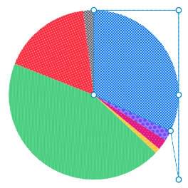
Shape screenshot for 44%. td[style*="--value: 44;"]::before { clip-path: polygon( 50% 50%, 50% 0%, 100% 0%, 100% 50%, 100% 100%, 95.2413525% 71.2889645%, 50% 50%, 50% 50%, 50% 50%, 50% 50% ); }Code generated for 44%. -
Rendering example for 64% 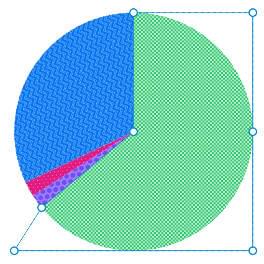
Shape screenshot for 64%. td[style*="--value: 64;"]::before { clip-path: polygon( 50% 50%, 50% 0%, 100% 0%, 100% 50%, 100% 100%, 100% 100%, 0% 100%, 11.474338% 81.8711995%, 50% 50%, 50% 50% ); }Code generated for 64%. -
Rendering example for 88% 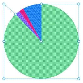
Shape screenshot for 88%. td[style*="--value: 88;"]::before { clip-path: polygon( 50% 50%, 50% 0%, 100% 0%, 100% 50%, 100% 100%, 100% 100%, 0% 100%, 0% 50%, 0% 0%, 15.7726445% 13.5515685% ); }Code generated for 88%.
Switch
Allows you to disable styles on the following table.
| Resource | Proportion |
|---|---|
| HTML | 2 % |
| CSS | 2 % |
| JS | 32 % |
| Images | 64 % |
Switch
Allows you to disable styles on the following table.
| Resource | Proportion |
|---|---|
| Images | 88 % |
| HTML | 2 % |
| CSS | 2 % |
| JS | 8 % |
Conical gradient
The use of conic-gradient() is promising for this case.
You'll find examples made by Ana Tudor and Lea Verou
— who actually wrote the specification.
conic-gradient() could be used in mask-image to replace clip-path
and drop the entire trigonometry thing, however there's a drawback:
since mask only clips visually, it prevents hovering other elements visible through the mask
— while clip-path really clips content, thus allowing interaction through element's layer.
If the current hovering interaction does not matter for you, you can change .chaarts.pie td::before
by dropping every custom properties —except --zoom— and clip-path, and modifying
mask-image to use mask-image: conic-gradient(#ffff var(--value), #0000 0); directly.
Caution: your value needs to be in % now.
Bennett Feely made a CSS Pie Chart Generator
based on conic-gradient() backgrounds : it might help you with the conic part,
but it needs more love regarding accessibility to handle patterns, at least.
Donut
On the <table> element, we add an --offset variable
that allows us to determine the size of the hole of the donut,
generated using mask-image and radial-gradient().
Ana Tudor has made
many examples of using mask-* on CodePen, have a look!
Switch
Allows you to disable styles on the following table.
| Resource | Proportion |
|---|---|
| HTML | 2 % |
| CSS | 2 % |
| JS | 32 % |
| Json | 1 % |
| Images | 44 % |
| Webfonts | 17 % |
| Other | 2 % |
css
.chaarts.pie.donut {
  --mask: radial-gradient(
  		circle at 50% calc(50% - 1.5rem),
  		#0000 0 var(--offset),
  		#ffff calc(var(--offset) + 1px) 100%
  );
  mask-image: var(--mask);
}

.chaarts.pie.donut td::after {
  --away: calc(var(--radius) / 2 - 2.5rem);
}
Polar chart
For this variant, wa change almost nothing: only the --zoom variable
and its implication in the scaling of portions using scale().
Switch
Allows you to disable styles on the following table.
| Resource | Proportion |
|---|---|
| HTML | 2 % |
| CSS | 2 % |
| JS | 32 % |
| Json | 1 % |
| Images | 44 % |
| Webfonts | 17 % |
| Other | 2 % |
css
.chaarts.pie.polar td::before,
.chaarts.pie.polar tr:hover td::before {
  --zoom: 50;
  transform: translate3d(calc(-50% * var(--is-rtl, 1)), -50%, 0) rotate(var(--position)) scale(calc((var(--zoom) + var(--value) / (100 / var(--zoom))) / 100));
}

.chaarts.pie.polar td::after {
  --away: calc((var(--radius) / 2) - ((var(--radius) / 4) * ((100 - var(--value)) / 100)) + 2.5rem);
}